Artist Statement

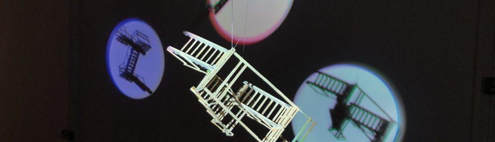
Levels is a photograph and photogram double triptych of stairs hanging in a sandwich of Perspex. These stairs are either made or found by Abraham, exploring the everyday in the conversation between photographic and sculptural techniques. Both triptychs’ use repetition in their formal structure, physically playing with the interpretation that is available to the viewer. This occurs due to the subject matter and develops the comparison of photograph A to photogram B. There is a focus on materiality, and the stripping of one material to make way for the other, taking you further into the conversation between photographic and sculptural techniques, and where the line is drawn between the two.

The theory behind this work comes from manipulation of space and material. Richard Galpin stripped the silver layer off scaffolding photographs to reveal fragmented forms in spatial compositions, transforming pieces into futuristic spaces through linear regularity paired with a geometric swarm. Abrahams’ work takes this into account, but instead removes the subject of the staircase, replacing it in another form. Using wire and natural light, the photograph and the missing subject become a sculpture, conversing with the physical, sculptural staircases that are depicted within the image. One could repeat the circle between sculpture and photography, for the way we think is not linear, but rather a story connecting the elements.

Abraham was specifically interested in the reality of images, with the progression of subtlety using an every-day item. Thomas Demand bought forward a different perspective of his miniature sculptural rooms through photography. Without the sculpture, there is a warped view of reality through the evidence of photography, ‘becoming a reality for its own sake’. Abraham bought this into her own work, displaying no context to size or material, but rather the product of photographic medium. The transfiguration philosophy of sculpture into a photograph and into a separate sculpture comes from Walter Benjamin. He describes that through photography, humanity can see the beauty of the subject, no matter how ordinary. Subtlety is found within the subject and the display of Abrahams’ work, depicting her ideas within the conversational double photographic triptych.

The choice of images was a difficult decision for Abraham, determining only those that would portray the light between photograph and sculpture and questioning where the line is drawn between the two. With a wide selection of photographic techniques and experiments, there was a temptation to create a new reality with them all, but simplicity was the key. Both photography and sculpture retain one instant, drawing upon a momentary process of a story between elements. The echoing similarity between staircases and triptychs bring together this story, blurring the line between sculpture and photography and ultimately asking whether there should be a line in the first place. Within future experimentation, Abraham wishes to look at the impact of size on this conversation, playing further with both light and reality. Abraham considers her own boundaries and relationship with mediums using the final material that illuminates the sculpture-photography conversation; light.


Levels

Levels is a double triptych of Perspex-sandwiched staircase-based photographs and photograms. This piece is one of many that communicates the conversation that I am growing upon – one that looks at the line drawn between sculpture and photography, and where these boundaries are blurred. 

There was some hassle with the final piece as the Perspex that originally arrived had four holes (one in each corner), and not the desired two, and I had only received 11 out of the 12. Finding a spare piece of Perspex in the workshop, I was able to cut this down and screw holes myself, creating the necessary number of pieces to create the sandwich effect. The next confusion was over gluing these together as I did not realise you had to squeeze the pieces of Perspex together as you brushed the glue between the seal. Once I realised that this needed to be done, I was able to quickly and efficiently glue all the pieces together in their pairs, ready for hanging.

I hung the Perspex sandwiches with 1.5mm corded wire, replacing the parts of the photograph that had been cut out with a physical substance. With the four holes, I had thought about using the wire to reach the floor, as this is not an abnormal hanging technique, however I quickly ran out of time while hanging. The final display was then two wires hanging from beams to the Perspex triptychs holding the photographs and photograms.

The final outcome of Levels is one that I thought I would not get to due to previous hassles in this project. I found that the piece had more impact than first anticipated through drawings and planning, and the spare piece of Perspex that I had cut and screwed myself was not obviously visible. I am proud of how the piece came out because the display was unique to the piece, and aided itself well to the conversation between photography and sculpture. If I were to do the piece again, I would not leave it so late to plan the display, allowing extra time for deliveries and mishaps before the deadline, however I would hang it in the same way due to the impact that the natural light has to the piece, adding itself to the conversation between sculpture and photography.

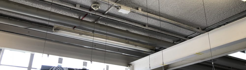
Between Week 8 Exhibition and Final Exhibition

Between the Week 8 Exhibition and the Final Exhibition, my ideas and practice further changed to include more experimentation with light within the mediums of photography and sculpture. Through the use of new matchstick designs, I continued to play with the aspect of reality, but I felt as though I wanted photography to play a larger part of the project. This is where the play with light, that was initially introduced in the Week 8 Exhibition, was highlighted through the use of photograms, photographs and cyanotypes. These photographic processes manipulated light in its raw form to create different realities on paper. Each of these also use light in a different way, playing with the manipulation of an added medium. Here, I looked into the Paradox of Photography in which ‘to insist on the materiality of the print would be to undermine its founding attribute, that of illusion’, so I ensured that I addressed the reader with a continued reference to light and sculpture, rather than photography. Taking it one step further and using inspiration from Richard Galpin, I stripped the photographic layer from the photographs that I had produced of stairs around the University of Reading. Removing this layer I ‘volatilised the real‘ and made the subject and reality difficult to determine. By removing this layer I have also inverted the conversation previously held and created a sculpture from the photograph, bringing together the conversation between sculpture, photography and light and determining where the line was between them. I wanted to ultimately display more within the final exhibition, but after a lengthy discussion I decided against this and drawn in the simplicity element that worked the best throughout the previous works. This investigation of the conversation between sculpture, photography and light was also aided through the glass workshop and my final display designs with photographs within perspex and hung by wire.

Week 8 Exhibition

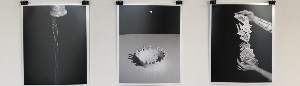
Within the Week 8 Studio 3 Exhibition, I displayed in the AV Room, down the corridor from the studio space. This area was curated by four of us, ensuring that everyone had the space that they needed, and the audience were able to interact with each piece in the intended fashion. I displayed all three designs of the matchstick stairs, hanging them from the ceiling with a different coloured spotlight on each. The different colours of these was an unintentional element that added to the work, highlighting the differences between them and allowing the evaluation of the individual staircases. There is also a practical element to the spotlights, as they ensured people did not walk into the staircases that were suspended from the ceiling. When people did walk past them, there was an element of motion that was carried forth into the staircase as they would slowly rock back and forth.

The blurriness of each image added to the element of optical illusion. This somewhat stepped in the opposite direction that I originally intended with the stairs, as I wanted them as real as possible, such as in the negatives I have recently developed. However, as they are hanging you can see their positioning, but you are more captivated by the almost primal draw of the shadow from the spotlight.

I found that I enjoyed these elements coming together, and I want to explore the elements of real versus optical illusions through the use of shadow and light. One way to do this may be through the use of photograms, or using some of the negatives that I have already produced. I am not sure what my next steps will truly be as there are now multiple paths I could go down.

Study Abroad Exhibition

The study abroad exhibition was a hit success with works being displayed by Romaisa BhattiCeldice JamesHira SyedZoë LeeChristine Glover and myself. We had a wide range of practices coming together in two locations to create a flowing exhibition, showcasing the work done while on study abroad in the previous term. I initially had concerns with my photography pieces being opposite windows due to reflection, however this was a smaller problem than first thought. I also felt that it was wise that I did not frame any of the pieces, as the uniform bulldog clips that I had practised in the exhibition preparation worked well for all of the pieces of work. Overall, I was happy to be part of the exhibition and found it a success. In the future, I aim to be more aware of the flow of people especially when there is work between two locations that are blocked by a locked door.

Artist Statement

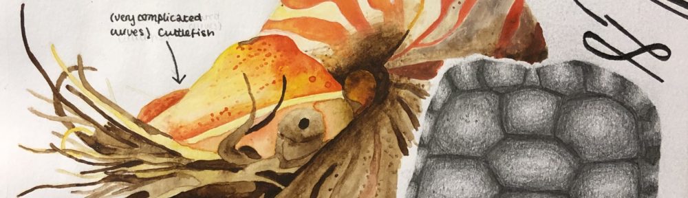
The recent collection of presented works from the study abroad term at the University of Ottawa has looked at the exploration of materials, with subsequent ideas stemming from given assignments. Found materials has been a key element within the works, including sieves, wooden chairs and hair. The use of found materials was inspired by both Ben Woodeson and Marc Sparfel who collect items from the streets and gave them homes within sculptures.  Sticking My Pieces to You introduced the manipulation and exploration of materials, developing ideas around bodily and world views. Using techniques including two-part and relief moulds, and alginate casts, plaster was manipulated in different consistencies. Through this handling of plaster, a head was formed with found torn maps, a chocolate pot and wire, displaying broken language in a mixed world.

The view of broken language and attempting to see the whole led to the work of Show Me Your Insides, using two children’s chairs and steel rod in a part sculpture of a tortoise shell. The wooden and metal shell, visible from all angles, balanced itself without fixtures, like the work of Ben Woodeson. The piece raised conversation about trying to understand more than what is presented, with the depiction of a natural shell adding to the unknown within the animal kingdom. The plastic chair whales of Brian Jungen inspired the manipulation of the supposed fixed material into something unimagined.

The idea of the manipulation of space and reality was bought into the three photography projects presented at the University of Ottawa. The first, Sans Camera, worked with a homemade pinhole camera and a five-minute exposure time to produce an unknown image. The camera was completely dependent on your positioning and timing, much like objects for photograms in the dark room, to produce a coherent image. The continual manipulation of different objects or negatives was a technique that Oscar Rejlander, the grandfather of photography, used.

Manipulation of reality within photography was especially sought after in Like Nothing You’ve Seen Before which challenged photography of objects unseen before, or in unseen perspectives. New perspectives of already familiar objects were found with the use of 35mm black and white film. This included turning fire escapes vertical in the frame, causing uncertainty of reality within the image. The orientation was inspired by Andrew Wright, whose series of trees puts them back in a vertical position. The final images interact the viewer, whose head wants to turn for the horizon to be flat, but then finds the image looks wrong because the reality is cropped around the stairs.

A cropped and controlled reality with the manipulation of material is finally seen in Emulating History. This project looked at the works of Harold Edgerton, whose invention of strobe lighting allowed people to see the extraordinary in the every day. By using self-designed three-dimensional printing, along with wire and slow shutter speeds, a false reality was created in the final images displayed. The element of false reality in photography confuses those who view it.

VIVA Presentation

At the beginning of Spring Term back at the University of Reading, I presented a VIVA Presentation (PDF), showcasing the artwork and subsequent ideas that were produced on my term abroad at the University of Ottawa.

I was to present the artwork created during my two practical modules of sculpture and photography, and the assignments of each.

The first photography assignment looked at the process of using the darkroom and objects at different heights from light sources and the photographic paper. There was a play of materials with greater thinking outside of the box to manipulate found objects. Inspiration for this project was Oscar G. Rejlander who is also known as the grandfather of photography. His works manipulate negatives several times to produce new photographs.

In the first photography assignment, there was also the use of pinhole cameras. Pinhole cameras have the same principles of a normal camera, but you have much more control over each element. You have to manually control the shutter speed and insert the photographic paper (instead of film or an SD card). My own camera had an exposure time of five minutes. Images would come out negative, so we had to use a dark room process for them to become positive photographs. This part of the assignment let me explore the unknown, especially with composition and objects, as well as getting used to the darkroom and the processes within there. If there was a chance to do the project again, I would have wanted to do a wider variety of simple photograms and invented negatives with different materials, as these had worked best. I would also try to get a cleaner developing technique as a streak of black can be seen throughout many of the images.

The second photography assignment we worked with 35mm black and white photography. The brief was to take photos of things you haven’t seen before, or take photos of things in new ways. Not only was thinking of new perspectives challenging, but the process of developing our own film raised concerns within this project too. I felt like I had a small advantage as everything was new to me, but it also stretched my knowledge of SLR cameras and the way in which we can angle ourselves, let alone the camera, to change perspectives. There was also development in the darkroom whereupon I used different filters to reduce the number of greys within the image, which can be seen in the bottom photograph. The techniques of dodging and burning were unsuccessful, however the final images were crisp and clear with a high range of tones.

For this project, I took inspiration from Andrew Wright, whose series of trees are put back in a vertical position.

The third, and final, photography assignment emulated and took inspiration from Harold Edgerton, who created strobe lighting and photographed the extraordinary in the everyday. I chose to emulate the milk drop coronet by using a self-designed three-dimensional print of a milk drop. I took inspiration from his everyday photographs to create the cards and the tap. Throughout each image, there is a confusion of reality because of the manipulation of each of the objects. The final display of the images was more professional than previously, adding a sense of completion to the images and project.

The stereotype series was a response to a call for international students at the university of Ottawa to create artwork that comment on breaking stereotypes. I created a 20 image series that show people aren’t always the label that you give them. This has now been published on the university’s news website. The prints and negatives themselves were not perfect, however the central idea, that people do not live under the stereotypical labels that we may give them, was still projected.

The sculpture module was more of an exploration of materials and how far we can stretch them, and learn from them. Within the plaster project, I used the processes of; two-part mould, alginate, relief mould, and generally handling the plaster in thin and thick consistencies. The head, which was the main part of the project, used found objects and is a result of learning more about the materials and how I was to manipulate it with cardboard, cheese-cloth, wire and cotton wool.

The second sculpture assignment was another exploration of material and process, but this time with wood and metal. I was able to transform two children’s chairs into part of a tortoise shell, using as much of the wood as I could to preserve each part of the chair in a new way. MIG welding was used on metal rods to create the empty section of the shell. It was said by others that in the final piece, there is a clear sense of enjoyment of the exploration of material and process. I was inspired by Ben Woodeson for this project, who balanced glass without fixings. The wood and metal are not fixed together in this piece, creating the sense of fragility.

Challenging stereotypes, one label at a time

Recently, in my term abroad at the University of Ottawa, I completed a collection of black and white photographs looking at breaking stereotypes. This work has now been published on the university’s website, along with a small written piece by Robert Greeley, for all to realise that ‘I Am Not The Label You Give Me‘.

“Is Charlotte Abraham a nerd? The third-year international exchange student included herself in a suite of photos titled “I Am Not the Label You Give Me” that challenges us to stop and question common stereotypes.

Abraham, who studied at uOttawa in the fall, recently returned to Britain to complete her degree in art and psychology at the University of Reading. However, toward the end of her semester here, she embraced the opportunity to take part in an exposition, hosted by International House, called “Don’t Feed the Stereotype.” The campaign took a pop culture approach to promoting diversity by debunking stereotypes.

Submissions could be in any medium, so Abraham decided to use the 35mm photography skills she had learned in a uOttawa art class. She loaded her camera with black and white film to create a collection of striking 8” x 10” images.

“‘I Am Not the Label You Give Me’ wants to get those who make stereotypical judgments to think about what they say and how it might affect those they are talking about,” Abraham says. “Pointing out that people are not always the stereotypical labels you give them is just a small step in the march to equality.””

Sculpture: Wood and Metal Assignment

This is the second of the sculpture assignments, looking at the use of the wood and metal workshops within the University of Ottawa. The project demanded two chairs as part of the brief, and I found two small children’s chairs that I soon wanted to make a curled up child, natural in form, such as the bodies of Kiki Smith. I wanted to attempt something more abstract, with inspiration from Ai Weiwei and Marc Sparfel, but found myself drawn to the more natural sculpture of Brian Jungen‘s plastic garden chair whales. After assessing the wood that I had, I found that the design was not compatible, and I moved onto what I thought would be easier; making part of a tortoise shell.

After choose a tortoise shell, I found that manipulating the wood into the forms that I wished it to go in was more difficult than anticipated, and several times I did not find it suitable to continue. Keeping all the smaller off cuts, I was able to salvage them into a smaller element of the shell that the larger element sat on. The final result of the wood was at first disappointing, as it was not what I had in mind. I initially wanted a smooth and formal shell that hid its imperfections, but as the project grew larger and time shorter, I found that the mismatch of the pieces was what made it unique and special. The metal created a hollow element to the shell, that was previously unavailable, and allows the audience to see through the wood, as well as at it. It was quite not of this world, much like the exploratory work of Tiffany April, whose work invites you in, much like this does. Balancing on its own also simulates the important balancing technique of Ben Woodeson, as the wood and metal are not connected to one another.

The final result named Show Me Your Insides, is a balancing empty shell, visible from all angles. It is an invitational piece that comments on the manipulation of material and trying to understand more than what is presented. The depiction of a natural shell in man made and natural materials adds to the unknown, especially of that within the animal kingdom.

I Am Not The Label You Give Me

Don’t Feed the Stereotype was a pop up exhibition with artwork by international students, and is continued campaign at the University Ottawa. This exhibition took a popular culture or religious approach to addressing issues of diversity, in an effort to promote a positive approach to diversity on campus.

I Am Not The Label You Give Me was my project response to this, showing how we are quick to judge people and give them stereotypical labels, even though these are often far from the truth. I chose 10 participants to write down a stereotypical word, phrase or question that they have been told or asked in the past. This could have commented on gender, sexual orientation, religion, career choice, and many other factors. This work was inspired by the six-hundred photograph series Signs that Say What You Want Them To Say and Not Signs that Say What Someone Else Wants You To Say by Gillian Wearing. Jo Spence also provided inspiration with her works that use found objects to display words. I wished to display it in a grid formation, such as the systematic formulation of Arnaud Maggs.

The photographs were taken with a 35mm camera and black and white film. I developed the film and photographs on hand, producing twenty 8×10″ photographs.

These prints are not perfect, and I understand that as there are scratches and marks on the negatives, and some needed a stronger filter than others. I would have liked extreme detail in my photographs, such as the ones Richard Learoyd produces, but I knew that this may not be the case. Despite these technical difficulties, I believe that the overall piece is still able to project the central idea, that people do not live under the stereotypical labels that we may give them.

I, unfortunately, had little say in the display of the prints within the pop up exhibition. I ultimately wanted them framed and on the wall, however due to the small space with no walls, the choice was to display them in a photo book. This allowed the piece to be more interactive than I perhaps originally anticipated, but did not have the same impact that I wished for. When displaying again, I will have them in frames and up on the wall in a grid formation.