Sculpture: A Conclusion

Overall, I have found this an incredibly fun, and also a slightly enduring project, right from the beginning, to the very last moment of walking away from the finished sculpture. I found the project brief making me think about sculpture, and artwork in general, in a new way, and found that I was stretching my boundaries in my ideas and concepts.
Choosing the design of the piece was challenging as I wanted to explore this project in so many different ways, and with more time and resources, I would have. I decided upon the Jenga tower and little people above all the other designs, as I felt this would have stretched my boundaries more, and I would have been happier with this design above the others. Through mixing with clay, paper and wire, I designed and made all the miniature figures, each with individualised poses and personalities. I decided after a few failed experiments that wire, wire and paper, or wire and clay, were not the best combinations to create the miniature people with. Choosing clay and continuing with it, was I believe, one of the toughest parts of the sculpture. This is because the figures are so small and fine, and clay can be damaged very easily (unfortunately, not every clay figure made it to the very end). It is also because clay was occasionally very difficult to work with, and I sometimes did want to give up on it. However, I stuck to my guns, because I knew how difficult any other methods of making the figures were.
The bricks, on the other hand, were very, very easy to make (lift a saw up and down a few times and voila, 54 bricks. I did have to ensure that they were the right size, which I did make a mistake on, before I started cutting. I embraced this mistake though, and preferred the design with the gaps between the bricks, rather than a solid tower. I also believe that this has given the tower some stability – this is very much needed as there is nothing holding it together! Sanding it down took a while, but I enjoyed having each brick and each sanded surface to be very individual because of this.
Displaying it was a tough choice, however I am overall happy with the design on the floor. This makes the piece interactive, which is one of the basic ideas behind the piece, and reverts me back to my childhood, which is a key concept behind the sculpture. Any other way of displaying would have ‘given off the wrong message’ so to speak, and would not have portrayed what I want it to.
If I had done this project again, or even this sculpture again, I don’t think I would have changed any part of my idea. This is because through the failures that have occurred, I have grown my piece and my idea, and I am very happy with the final piece.
Photos below include the final set up of the sculpture and the small people interacting with three other sculptures around near my sculpture.

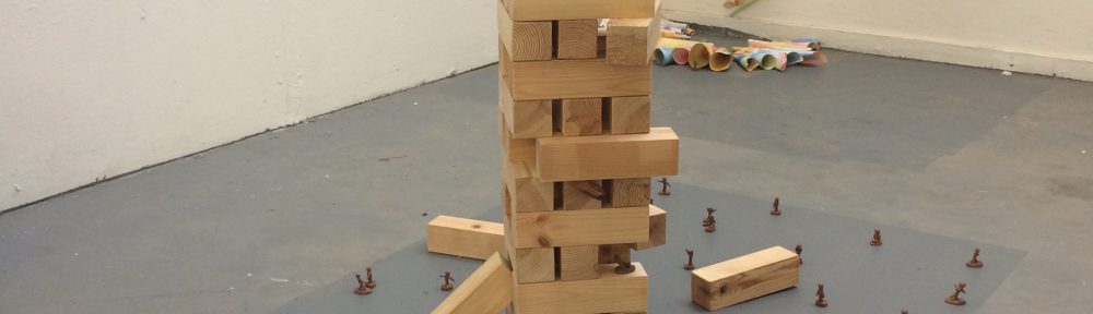
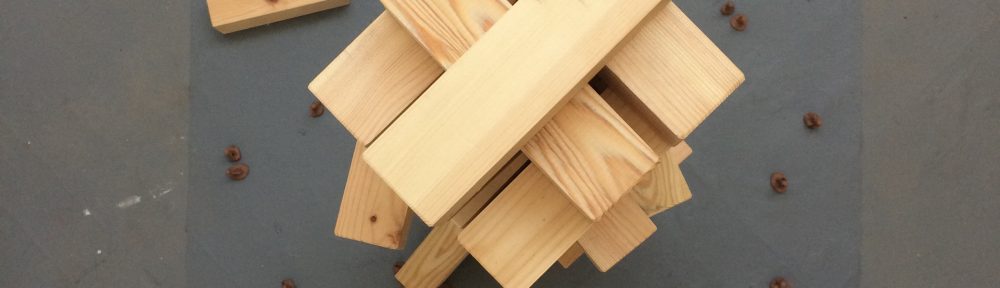
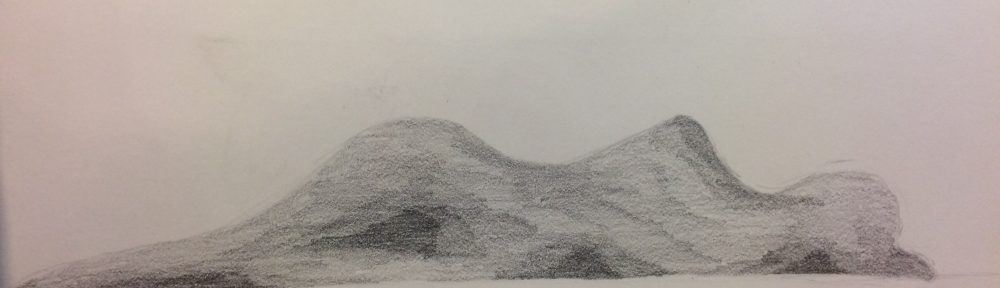
Making an impossible sculpture 

An Impossible Sculpture was our first introduction to this project, whereupon I came up with several ideas. To do with making the impossible sculpture, we were briefed that we should make a section of the sculpture idea. I wanted to make a miniature of one of my ideas, as I thought that would be more exciting to make and engaging for the viewer. Following through with this thought, I wanted to have the chance to look at the board game ideas that Jasmine and I came up with together.
After talking to Jasmine about the idea that she was looking into, and asking her if it was acceptable to use our idea, and to recreate it in a miniature sculpture. She said yes, and so I started to plan the idea in a scale drawing.
design 3
I had a look at all three designs that we had thought of, and I feel like any three of these designs (Jenga/Pinball/Bowling), would have been suitable to continue on within this project, however I wanted to create a scale version. Looking at the designs closer, I felt as though the Jenga tower and figures were the most suitable as a scale design (even though I am sure I will create the other two at some other point to create a three piece set), and went on further planning my ideas for this.

Design
The artists that I have been inspired by includes that of Jake and Dino’s Chapman and their piece of Chapman’s Hell. This piece is incredibly detailed, with many elements adding up to intricate scenes. I would like for my sculpture to be this intricate, although maybe with not as many people, blood and gore. Coupled with the intricacy, I would like for the small people that I make to be around the size of the figurines that Nic Joly creates using wire, paper and clay. These are highly detailed small figurines, and I wish to recreate this level of detail. I am unsure yet as to whether the figurines that I am going to make are going to be painted or leave as clay sculptures, but wish to explore this further later on.
As a child, I remember fondly playing with Lego, and wanting to play with small train sets. Looking at these further, they are often to scale, such like I wish my sculpture to be. Mini Models looks further into this, and has inspired me to look at the surroundings of the sculpture, and whether I want to look into adding extra decoration (which I will look into later on). Small People Films has also allowed me to see how small figures can interact with their environment compared to ‘normal’ or ‘every day’ sized figures and objects. I have found by looking at many films, depending on the scale of the figures and surroundings, can impact the level of detail and realism that the figures can contain. So can my figures be very simple? Non-realistic? Simply shapes? Or do I have to be highly detailed as small figures this size can be?
Other artists that I have looked at include;

  • William Kass, a photographer who uses food and miniature figures to create scenes on the viewpoint of the miniature figures. This would have been a really interesting prospect to play with the food, as it was part of one of my other ideas for the sculpture. However, I enjoyed the thought of the traditional games being impossible more than food scenes.
  • Vincent Bousserez, a photographer who often uses the body and plastic miniature figures to create unique scenes. I loved the unique use of the body and particularly the piece where a small figure uses a lawnmower to shave a beard. I wish to use this uniqueness in my own work.
  • Christopher Boffoli is a fine artist and photographer who creates fine scenes with every day foods. These are not as detailed as the work of William Kass, as there are only plain backgrounds. Once again, I love the creativity of the scenes with the food, and the simplicity of the detail that each scene contains. There is not a large amount happening in each scene, but the figures that are in the scenes, and the foods that are used, are highly detailed and placed with caution. I wish to use this simple detail in my sculpture piece.
  • Kurt Moses and his wife takes photos of miniature people in everyday settings. These have a high sense of realism about them, because they have been taken with a fish-eye lens, and in humans natural environments such as cities, towns, and beaches. I wish to have the realism that these pieces have which includes the use of the wider world.
  • Matthew Albanese is a fine art photographer who shoots landscapes from a tabletop in his studio. His intricate landscapes are made of mostly everyday items that are found in the home and garden. I looked at Matthew Albanese as I am unsure whether I want to expand the pieces to the surroundings such as trees, roads and other daily environments. (I go into detail about this later on) If I wish to do so, I would feel as though I would use same, or similar materials to Matthew Albanese in order to create a surrounding environment for my sculpture to sit in.
  • Slinkachu is another artist who uses an external environment. Unlike Kurt Moses and his wife, Slinkachu often uses preexisting forms that are already in the environment, such as a broken pillar or a bag of rubbish left on the side of the road. This has made me consider whether I could exhibit in environments such as this, or take the piece around to different environments and have a photography series along side. This, however, would imply that it is supposed to be this small, but my intentions are for a scaled version. I still wish to play around with different environments and displays.
  • Diana Armfield RA uses many mediums, including that of pencil drawings. These pencil drawings are left in a rough state after many layers of lines have been added, in order to create shapes and scenes. I wish to play around with this style of roughness when using the clay, and in the final display of my piece.
  • Donald Hamilton Fraser RA uses a soft, complimentary colour palette to paint seascapes. These blues, yellows, whites, and deep greens, are colours that I wish to explore when looking at painting the miniature figurines. I chose the colour palette of this artist, as I wanted to create that same soft use of block colours, even when the scene in its entirety is going to very full and giving a sense of panic. I also wish to see how the colour palette will change the views of the piece, and whether adding more red, for example, will make people think that there is more death in the piece.
  • I enjoyed looking at the work of Henry Walsh as I wanted to discover whether the figures in his painting are ‘normal’ sized people simply painted small, or whether they are small figures that are painted their true size. This question is raised as there is either little or no reference to the size of the figures that are painted. I also want to try and explore this question within my work, and possibly look at photographing the figures in order to gain this perspective. I also want to have a play around with the darker colour palette that Henry Walsh explores, with the contrasting bright white background. The main inspiration from this work showever, is the anonymity of each individual within the piece, even though they come together to create a community, and therefore must have character.
  • Anita Mandl creates smooth, simplified sculptures of animal forms, including that of a polar bear, penguins and elephants. Each sculpture has no faults or sharp edges to it, and adds to the smooth surface that they indivudually have. I enjoy seeing how each sculpture is detailed enough to identify the animal, however simple enough that it isn’t an overload of information. I wish to play around with having a smooth surface for each of the small figures I intend to create, and whether this still allows them to be anoymous, and yet still have individual character.
  • Heather Cassils works with large (generally 2000 pound/~900 kg) block of clay, beating them in a series of kicks and blows. The result of the performance is a lump of clay that has been manipulated in new ways. Each piece is indivudual and unique to that performance. The evidence looks soft, due to the way it has been handled, and the waves that seem to appear in the clay, and yet indestructable, because of the sheer size and weight of the object. I wish to play around with the roughness that Heather leaves the clay in, and contrast it against the soft and smoothness of Anita Mandl’s work and the way in which she produces her sculptures.
  • Antony Gormley created a series of small terracotta figurines that filled the floor of a large room. Once again, each of these figures is somewhat impersonal, however you soon start building a connection with each one due to the way in which they all stare at you in one giant wave. Each time you look at the pieces, you spot something new. I also enjoy the sheer scale of the number of figurines that are in one space. I wish to explore the number of figurines that I would need for my sculpture, including a room full, to a handful.
  • Aurelien Froment looks at Jenga blocks of varying sizes, and allows people to delve into a wooden box in the corner of the room, and make their own structures. I would love for people to participate with my Jenga tower in this way, and yet at the same time, the tower and the clay figures are very delicate, and I do not wish these harm. I have therefore decided to leave the tower half played, as though people are in the middle of playing Jenga, just as Aurelien Froment’s piece is half played at the end of the night.

Above: a selection of images representing the variety of inspirations for this project. See relevant posts for more images.

Little People

There was a lot of work and preparation into what the miniature figures were going to look like, what materials they were made out of, and the colours that they might be painted. Overall, this was a long process, even when the ‘final design’ of the figures were chosen.
For the little people, I decided to explore different mediums that which I could make them in, that the artists I have been inspired by, have also explored.
I firstly looked at toy soldiers, but quickly found that the positions that they were in, and the accessories of guns and hats, was not the environment that I wanted to create. There was not an easy way that I could determine to reshape them, and so decided to look into making the figures myself.

When making the people, I first decided to look at wire. Using floral wire, which is generally very thin and malleable, I was able to create some small figures, however if one mistake was made for the proportions, then there was enough wire in order to create the legs, and to connect legs from an extra piece of wire was not worth that extra wire. Not only were the legs a problem, but there was no way in which they were able to stand up (hence the pen and the pencil in the photos). This was wire out of the window.

I know I just said that wire was out of the window, however I decided to give it a chance when mixing it with paper and clay. What mistakes these were. Both the clay and the paper were hard to manipulate around the wire, and both additions made the figure loose its shape very quickly. There was no easy way of attaching the paper to the wire, or to sculpt it around the finer areas, such as the head of the figure. The clay looked okay, apart from creating an overweight character that could not stand up. However, once the clay dried, there were large cracks, and thus was deemed improbable material for the miniature figures.

This led me to the use of clay only for the miniature figures. I did not think that this was going to work, however after a quick play around and following a tutorial on how to make a clay figure (mine unfortunately broke before I managed to take any photos) – www.youtube.com/clayfigure – I felt like I was getting the hand of things. Now I had to choose the size, and also how difficult I wanted to make my job. Because I was doing the sculpture at 1:50 scale, I decided to search up the average human height (~180cm according to WorldData), and divide by 50 = 3.6cm. I felt that this was too talk, especially considering that toy soldiers are around 3cm, and when placed near the bricks, seemed a better size.

I made around 50 people in order to get a ‘crowd’ sensation, and to get lots of different personalities and styles within the piece. I decided to keep them quite plain with no accessories such as hair and clothing, as this would make the pieces seem ‘out of the norm’ and carving would make the clay very weak. The lack of facial expressions with the mix of individually made, does give them their own personalities in the environment. I enjoy this aspect, as there are no two the same, such as humans in society, and I sometimes feel as though I can pick out the figure that I feel most like (at that point in time that is).

Colour was also an important aspect to chose upon, including what colour palette to use and also whether the people should be painted, or not. I decided to use a similar colour palette to Donald Hamilton Fraser RA. These colours included;

  • Blues: Ocean Horizon, Blue Wash, Blue Prism, Blue Bottle, High Altitude, White Lightning, Droplet, Morning Jewel, Lunar Landscape
  • Yellows, oranges, reds: Garnet Symphony, Deep cream, Banana Dream, Moroccan Sands, Ripe Mango,Golden Nugget
  • Greens: Lime Zest, Deep Forest, Green Slate Path, Moss Green
  • Browns: Char Latte, A Seat at the Globe, Buccaneer, Chocolate Cream Pie, Deep Autumn, Nutmeg Dust
  • Purples: Heather Bloom,
  • Whites: Quartz Grey, Indian White

I decided to not paint the rest of the figures as the paint was much harder to apply than anticipated. It was hard to apply (for example, I could not get underneath the arms in the little person I painted), the clay soaked up the paint, and it was incredibly patchy and overall looked horrible. There was also the challenge of hair and accessories, that I ummed and ahhed about, and which would take even longer than necessary to complete on each figure. Adding colour to all of the figures would also distract the viewer of the piece from the simplicity of the sculpture, and what it ultimately represents. I mentioned earlier that I feel like I could sometimes pick out the figure that I am at that particular moment, and that they are all individual with personalities. I feel that adding colour to all of them would make this too obvious, and people would not get the meaning of the small figures, but just marvel at the detail of them.

img_6933
The progression of the miniature people including; wire and paper, wire and clay, clay, clay and paint, and just wire. Displayed in front of a single Jenga brick to get an idea of the sheer size and proportion of the final design.

Jenga
For the Jenga part of the sculpture, I decided that I wanted to cut wood, such as the traditional Jenga game. There are 54 pieces all together, in 18 layers, inspired by the giant, and normal table-top Jenga games. We had 2×2″ wood that was available to use, and found that if three pieces were placed next to each other, this would be the same as 15cm. I then cut the wood as 15cm long each, so then the tower would sit square. Once the pieces were cut, I saw that there was a difference between the length of the pieces, and the width of three of them placed together. Oops. Instead of pondering on this, I decided to sand down the edges of the pieces, not only to sand away the rough parts and splinters, but also to create a rounded edge on each of the pieces. This, for me, created a more professional look, such as the original Jenga game, and makes the pieces themselves look flowing.
The misjudgement of the sizes did take me by surprise, as the wood that was cut, was not in fact 2×2″. This did make me a little annoyed, however I pieced the whole tower together with spaces in between the three pieces in each layer, and felt as though this has worked better than a solid tower would have done.
To see how I pieced the Jenga tower together for the final sculpture, see Displaying an impossible sculpture.

There are a couple of expansions that I could do with this sculpture. First of all, I could add decorations such as trees, roads and houses, in order to create a full landscape. This has been inspired by many of the artists as they also work with the larger landscape. However, I soon realised that this would not only be too much work, but this would have also taken away the detail of intricacy of the clay people and the Jenga tower. As the piece is all about the relationship between these two, I did not want to take the viewer away from this intricacy.
There is also the expansion of different games, that were originally thought of alongside the Jenga tower. This includes a pinball game and a bowling alley through streets. Once again, I feel like I would have enjoyed making these, however there is a lack of time and I also feel that more than one impossible game sculpture, would detract the attention from the original Jenga tower and clay figurines.

But, how did it go?

Artist Statement

Birds_Eye_View_of_Jenga

The main concepts behind my sculpture are impossibility and childhood. As we grow older, we often forget about small things, and regress to childhood when such objects are presented in adulthood. In a world where we are forced to grow up, why should we not be able to play with childhood toys? My sculpture is a part of these questions; childhood and impossibility.
My work presents a three foot tall wooden Jenga tower, partially played, surrounded by a large crowd of miniature clay figures. The processes used included cutting, moulding and sanding. I was initially inspired by the work of Nic Joly, and his pieces Why Not? (Joly, 2015), and London Calling (Joly, 2017). These are highly detailed pieces depicting a story between giant and miniature, through the use of miniature clay figures. From this, I began to experiment with clay, wire, and paper to create miniature figures. This led me to the work of Antony Gormley, Field (Gormley, 1991), a room filled with small handmade terracotta figures. This inspired me to create a large number of clay figures for the sculpture. Gulliver’s Travels, a 1726 book (Swift, 1726), and a 2010 film (Gulliver’s Travels, 2010), and The Borrowers (The Borrowers, 1997), further informed me of ways in which miniature figures interact with their larger environment, and connected me back to my childhood.
In my own work, I wanted a significant size difference between the figures and Jenga tower. This surrounds the theme of impossibility as the sculpture is a 1:50 replica of a playable Jenga tower, the blocks inspired by Debuilding, Aurelien Froment (Froment, 2001). This would be impossible to play at the larger size, as the pieces would be difficult to move, and a hazard if played too high. The inspiration came from Claes Oldenburg, and his vision to create impossible sculptures, including bowling balls down Fifth Avenue (Oldenburg, n.d.).  Through the use of giant versus tiny, I want the viewer to interact with the piece, to bend down, to view it closely, and to think about smaller things in life.
In addition, I wanted each figure to be plain and inanimate with minimal detail, showing we are all the same in society. However, each figure is handmade, and gives the sense of individual personalities, and connection to a community, all with the same fear of the impeding fall of the Jenga tower. A lack of identity with a contrast of large personalities comes from the inspiration of Antony Gormely, Field (Gormley, 1991), and Anita Mandl, with her simplified animal forms Young Elephant (Mandl, n.d.), and Little Blue Penguin (Mandl, n.d.). Not only do these miniature figures interact with the Jenga tower, but also of those pieces displayed around, and allows the viewer to interact closer these.
My piece presents ideas about the illusion of impossibility and the connection to childhood through the contrast of size and displaying on the floor.  The sculpture depicts a giant, half played wooden Jenga tower, surrounded by miniature clay figurines. The contrast between the size of the blocks, tower and figures distinguishes the impossibility of the project in a real size. Displaying on the floor regresses the viewer to childhood.

Blog: https://charlotteabrahamart.wordpress.com/
Froment, A., 2001. Debuilding. [Art].
Gormley, A., 1991. Field. [Art] (Tate Liverpool).
Gulliver’s Travels. 2010. [Film] Directed by Rob Letterman. Ireland: Davis Entertainment; RatPac-Dune Entertainment.
Joly, N., 2015. Why Not?. [Art] (Castle Galleries).
Joly, N., 2017. London Calling. [Art] (Castle Galleries).
Mandl, A., n.d. Little Blue Penguin. [Art] (Curwen Gallery).
Mandl, A., n.d. Young Elephant. [Art] (Curwen Gallery).
Oldenburg, C., n.d. Untitled. [Art] (Frieze).
Swift, J., 1726. Gulliver’s Travels. 1 ed. s.l.:s.n.
The Borrowers. 1997. [Film] Directed by Peter Hewitt. United Kingdom: Working Title Films.


An Impossible Sculpture

Our task for this week was to design our very own impossible sculpture, such as those designed by Claes Oldenburg.

I have had several ideas oflr this including that of a Jack in the box coming out of a lake, giant pinball/bowling alley/jenga through the streets of Manhattan (for example), giant food leaning up against the Empire State Building, a giant lucky cat pounding into a building or the floor, human hills, plastic plait, an exploded view of a square (with glass buildings, trees, etc), or a giant Barbra Hepworth playground. I would have enjoyed looking at all of these in greater detail, however I decided to look at only a couple.

I decided to concentrate on greater detail the bowling alley, where I collaborated with Jasmine to create the idea. The overall plan was to have a set of runs in several streets to make up a while bowling alley. Olathe in Kansas City, Kansas, I found to have the specific straight roads next to each other that we could use. (127th to 175th street). In addition to the bowling alley, we also designed Jenga where you have to use bulldozers to take your piece out, and cranes to place them on top. The pieces themselves would be metal blocks, such as those they use for the shell of buildings. The last idea within this set is the pinball. This has the same basis as the bowling alley however we would choose a hilly area with twisting an winding roads. See above and below for the design of the bowling alley.

I also took a closer look at a plait. I had a couple of ideas from this design and that was to disrupt life by having the piece as big as possible, draped over motorways and building, OR, having it as almost like a tripwire across all entrances, exits, sidewalks, in order to disrupt life too. I wanted to do this in plastic as I feel very strongly about the subject matter of how much plastic we use, the reuse and recycling of plastic, and the fact that much of it still ends up where it is not meant to be e.g. the sea.

Taking a look at the body hills, I looked at yoga poses, which are often curved and smooth. I found that using yoga poses made them seem like hills, however they are still bodily shapes. These would be interesting to recreate in the third dimension.

Lastly, I had a look at the giant food leaning against the Empire State Building. I chose to do it against this iconic structure in order to gain the sensation that the food is massive (like, really really big). This was fun to design and I look predominantly at junk food as this is the food that the current generations turn to when snacking. I felt like this would contain the bigger message of the problem about junk food, just as the plait contains the bigger message about plastic.

The Sole of A Student’s Day

The Sole of A Student’s Day is our final video for the video art, in which we worked in a group to complete, including; Layal, Hadis, Ikrah, Georgia, Romaisa, and myself.

Throughout this project, we came up with a story, filmed, and edited an entire 4 minute video that we were able to proudly present. It was quite refreshing working in such a group as many of these people I had not worked with before (no one except Romaisa). This allowed us to have new and fresh ideas as we worked all together. I also found that we had done things as a group that I would not have necessarily chosen if I was working on my own. This includes the inspiration of Pipolotti Rist and her contradictory work, which we continued through the use of the backing track versus the video itself. I liked the use of a unique theme of feet, as this was a different perspective to view a day of a student. This was very difficult to begin with, however once we got the hang of filming with a broomstick, clamp and camera, it was a very fun and enjoyable experience. Turning corners was still, and still is a challenge we need to overcome.

There was also a downside to working in such a large group as we were not all able to meet at one time through the week, and so messages were often second hand. I also felt like a lot of the work was passed to me, as the majority of the time, I was filming, or being filmed, and I felt responsible for getting the equipment, as no one else within the group was being proactive about it. I also spent around 12-13 hours editing the video, even though two out of our group of six had done the editing tutorial. Communication about the editing was also not done in person but rather through messaging because of the continual problem of not being able to meet up all on the same day. If we had to make the video again I would want to make it’s so that it isn’t as detailed and it was just one main thing, such as the date scene, as this would have allowed us to get some more detailed footage. Either that, or to literally record a pair of feet continually for a whole day, an speed up that one piece of footage (this again would have its complications but would be very fun to watch and complete).

Although there were many complications, I believe that our video came out very well. It was not what I thought we would produce, as initially I believed that we would do a small, cute little video of the sorts. However, it was an experience of where I gained many skills that which I hope to take into other pieces that I will complete throughout my degree.

Update 30/01/17: We showed all of our videos together today and got feedback – our lecturers loved the edit and the way in which the video tricks you at the beginning as though it is going to be a music video, but then shocks you when the Irish dancing comes in, and then you’re not really sure what is going to happen. They also commented that the editing was very seemless and worked well. One of our lecturers also said that they started to look at the feet as though they were an entity of their own and they had become their own character. So overall, a great success!

Extended version:

Other Groups videos:

Artist Statement

The main concept behind my painting is the confusion of reality, and the interconnection between man and nature. With the increasing growth of the manmade structures, nature is often pushed to the side, and sometimes even forgotten about. In a world where everything is electronic, we can often forget what reality is. My painting is a part of this story, a question of reality encapsulated in the wilderness of nature.

My work presents a large, portrait canvas, depicting a water forest scene and a partially derelict house. I was initially inspired by the work of Peter Doig, and his Concrete Cabin  (Doig, 1994) and Reflection (Doig, 1997) pieces. These are melancholic and contrasting pieces depicting thin forests. From these, I began to experiment with oil paints to create the same sense of depth within the forest that I would paint. This led me to the contrasting and colourful backgrounds of Zeng Fanzhi, with his bright backgrounds and dark, mysterious twigs in the foreground (Fanzhi, 2015). Inspired by this, I wanted to create the same contrasting atmosphere using a similar palette and repetitive layering of the paint. Under The Skin, a 2013 film (Under The Skin, 2013), further informed me of a large forest with unknown events occurring all around and to the central character, and also the depth and detail of forests, which I wish to recreate.

In my own work, I wanted to have a contrast in mood between the forest and the misty, colourful sky. By referencing the earlier artists, I hope to confuse and question the viewer as to “which way is up”, a question inspired by James Elkins (Elkins, 2009, pp. 11-32). I also wish to evoke the memory of nature in the viewer as they live in the ever-growing electronic world.

In addition, I was inspired by Cabin Porn, a book that takes you around the world with different cabins, with everything from being built with boats to being built on a cliff edge (Porn, 2009). This book helped inform my design of the small derelict house within the painting. I wanted to include a house within the painting, especially within an environment such as the forest, as they were once the home to many an adventure in childhood.

My piece presents ideas about the confusion of reality and the interconnection between man and nature through a contrast of colour and mood. The painting depicts a grand, overwhelming forest rising out of a lake, next to a small, derelict house sitting on the water. The contrast between the deep greens and blues of the forest and the light washes of reds and yellows in the misty sky distinguishes the contrasting atmospheres and highlights the interconnection and the power that nature has over man.


References:

Doig, P., 1994. Concrete Cabin. [Art] (Saatchi Gallery).

Doig, P., 1997. Reflection (What Does Your Soul Look Like?). [Art] (Tate Gallery).

Elkins, J., 2009. What is Painting?. [Online].Available at: www.jameselkins.com. [Accessed November 2016].

Fanzhi, Z., 2015. Blue. [Art] (Gagosian).

Porn, C., 2009. Cabin Porn Archives. [Online]. Available at: http://cabinporn.com/archive. [Accessed 27 November 2016].

Under The Skin. 2013. [Film] Directed by Jonathan Glazer. UK, USA, Switzerland: British Film Institute.


Thursday Exhibition Opening

And so it happens! Our first art exhibition as a Year 1 Art (and Psychology) student! It of course featured free wine, coke, orange juice and crisps. It was so nice to see everyone’s up on the wall after some incredibly hard work was done. For those who don’t know, our year is split into two groups depending on which day we get taught the Studio module. For us this year, it is the Monday group (my group) and the Thursday group (our enemies in this particular battle). I do have to be incredibly biased in this situation, however, and say that the Monday group definitely won this battle… And yet the war continues!

(Photos in order of; Thursday group, Monday group, Thursday Group, Monday group.)

Project 1.0 Political Prints

FIRST PROJECT OF THE YEAR! (Not including the summer project.)

So from the Introduction to Political Prints session that we had, we were given the task of producing our own political prints.

Here was our task debrief;

Art has had a troubled relationship with propaganda, which is frequently seen as overly didactic.

The history of print as a medium is often associated with radical politics. From the Russian constructivists to the art students of May ’68, to contemporary protest posters from many artists in countries around the world, artists have used print to create quick and bold statements, to combine images and text.

Using stencil printing, we would like you to produce an image that functions as a piece of propaganda in response to the challenges we face today in our societies and in our cultures. Consider the relationship between the imagery you use and the concepts you are exploring and think about what issues you would like your 2016 student revolt to address!

Source: Task debrief – Reading University Blackboard Learn

There are a lot of things that I feel passionate about and that I could do my stencil printing on, including the topics of; endangered animals, brexit, the American elections, sexism and feminism. But after a few hours of having a sit down, think, and a doodle (what else are you supposed to do?), I came across the quote

Can you see me now?

Source: Unknown

This led me to looking at the topic that was raised a few months back;

Free the nipple

When this hit the news, I felt incredibly passionate about the topic. My take on the subject was all about the women who were breastfeeding their babies in public. This is in no way, shape or form, is a sexual act, unlike how some men and reports I found were showing this. It is a simple act of the human body to want and need food, including those babies who still need fresh milk from their mothers. It did, however, become a fashion statement very quickly. This personally annoyed me as many of the articles reporting the ‘#freetheboob’ movement, were commenting on how uncomfortable bras were and how it is just commercialism that is making us buy bras. How ‘Free the Nipple’ became summer’s biggest fashion trend – EveningStandard. Yes, it has been scientifically studied as to whether women need to wear bras or not, and apparently we don’t, (Here’s Why You Shouldn’t Wear A Bra, According To Science – IFLScience) but that doesn’t mean we need a hashtag and a fashion trend about it, especially when it draws it away from the Free the Nipple campaign, which is very different.

I did not know this, but Free the Nipple is a lot bigger than just the whole breastfeeding in public taboo. The Free the Nipple campaign has been described as

…a global campaign of change, focused on the equality, empowerment, and freedom of all human beings. Free the nipple has become a premiere voice for gender equality, utilizing all forms of modern media, to raise awareness and effect change on various social issues, and injustices.

Free the Nipple Campaign

Looking closer and at more detail of what the Free the Nipple campaign truly stood for, I was inspired to create my own piece of propaganda to support the campaign.  I couldn’t exactly just whip off my shirt to reveal no bra to show my point, like hundreds of men and women did on Brighton Beach to protest against the social media policies banning on the female nipples.

‘Free The Nipple’: Hundreds Gather In Topless Protest On Brighton Beach – Huffington Post

I could, however, create a stencil printing, using my new found information on the Free the Nipple campaign, and the quote that inspired all of this; Can you see me now? I did have to take a moment to figure out what I could do inn order to get my point across – the female, and the male nipples, are something that we should not be ashamed of and that we should not hide. It should not be a taboo.

I therefore created the following design whereupon the nipple and the boob that are uncovered are the centre of attention, being the focal point of the print.


I initially couldn’t decide on whether I wanted this design, or to invert it and print where the majority of the page was black, showing a white boob and a black nipple. However, I soon realised that this could not be done as there would be multiple areas of the print that were not connected, hence I went for this design.

I also changed the composition of the wording several times. The consistent parts were the bra itself, the O, U and nipple. Initially, the ‘o’ of the ‘now’ was smaller, as to represent the other nipple. I did change this as it looked, to me, out of place, so I changed it to the now, larger ‘O’. I also changed the composition of the ‘y’ as originally it was vertical. The reason for this change was due to it being more aesthetically pleasing, but looking back, it now also follows the curvature of the breast which accentuates both the breast and the nipple.

The screen printing itself was interesting.. I have done screen printing before, however the screen printing ink has never stained this much! A tiny bit on my hands and it stayed there for days. As per usual, some of the prints were absolutely atrocious and barely legible, however there were a couple of them which were crisp and defined!

Drumroll please…

img_44121

img_44131

img_44141

Our exhibition isn’t fully up yet, but will be open on Thursday afternoon, so more photos and updates soon!