An Impossible Sculpture

Our task for this week was to design our very own impossible sculpture, such as those designed by Claes Oldenburg.

I have had several ideas oflr this including that of a Jack in the box coming out of a lake, giant pinball/bowling alley/jenga through the streets of Manhattan (for example), giant food leaning up against the Empire State Building, a giant lucky cat pounding into a building or the floor, human hills, plastic plait, an exploded view of a square (with glass buildings, trees, etc), or a giant Barbra Hepworth playground. I would have enjoyed looking at all of these in greater detail, however I decided to look at only a couple.

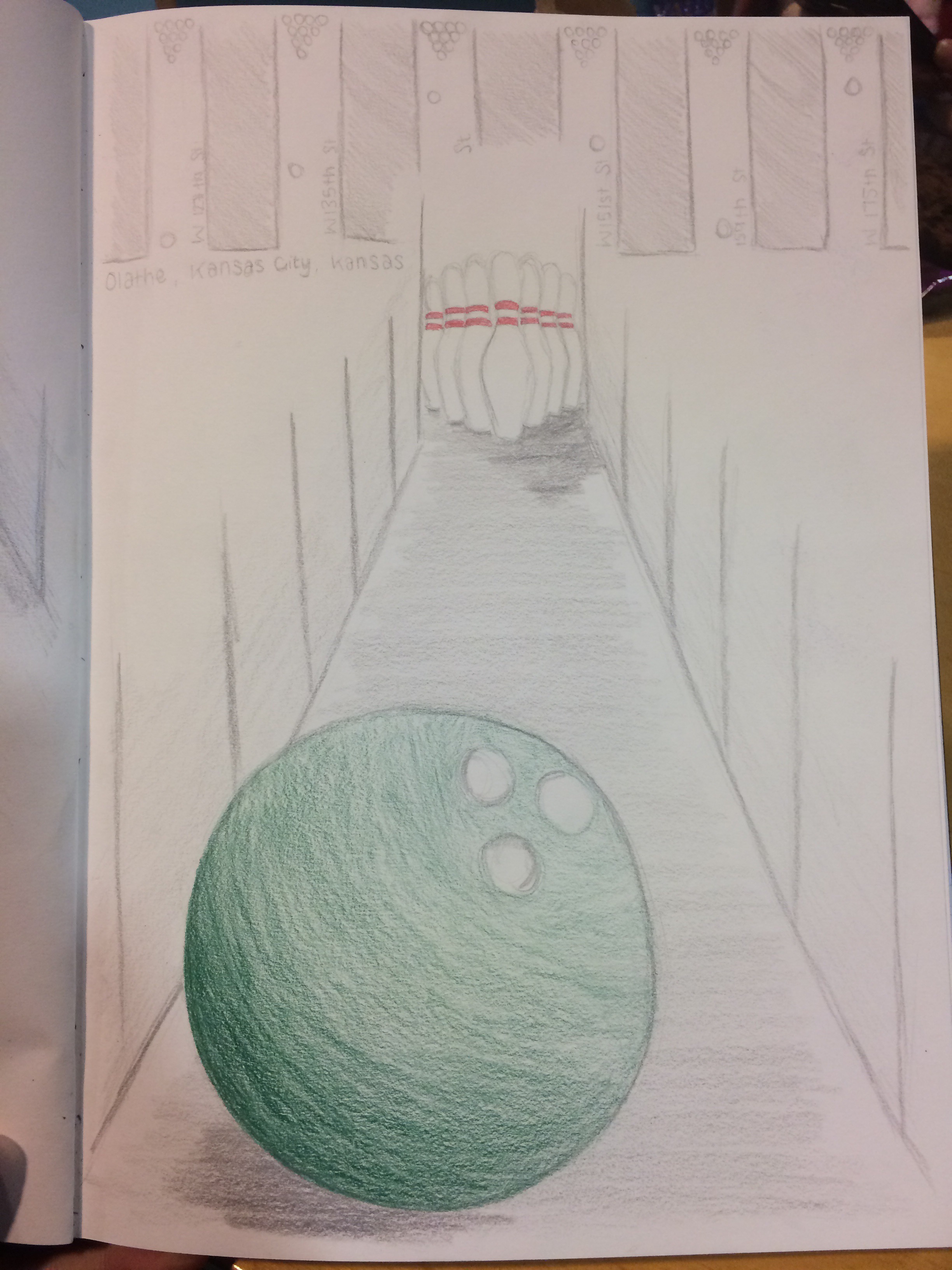
I decided to concentrate on greater detail the bowling alley, where I collaborated with Jasmine to create the idea. The overall plan was to have a set of runs in several streets to make up a while bowling alley. Olathe in Kansas City, Kansas, I found to have the specific straight roads next to each other that we could use. (127th to 175th street). In addition to the bowling alley, we also designed Jenga where you have to use bulldozers to take your piece out, and cranes to place them on top. The pieces themselves would be metal blocks, such as those they use for the shell of buildings. The last idea within this set is the pinball. This has the same basis as the bowling alley however we would choose a hilly area with twisting an winding roads. See above and below for the design of the bowling alley.

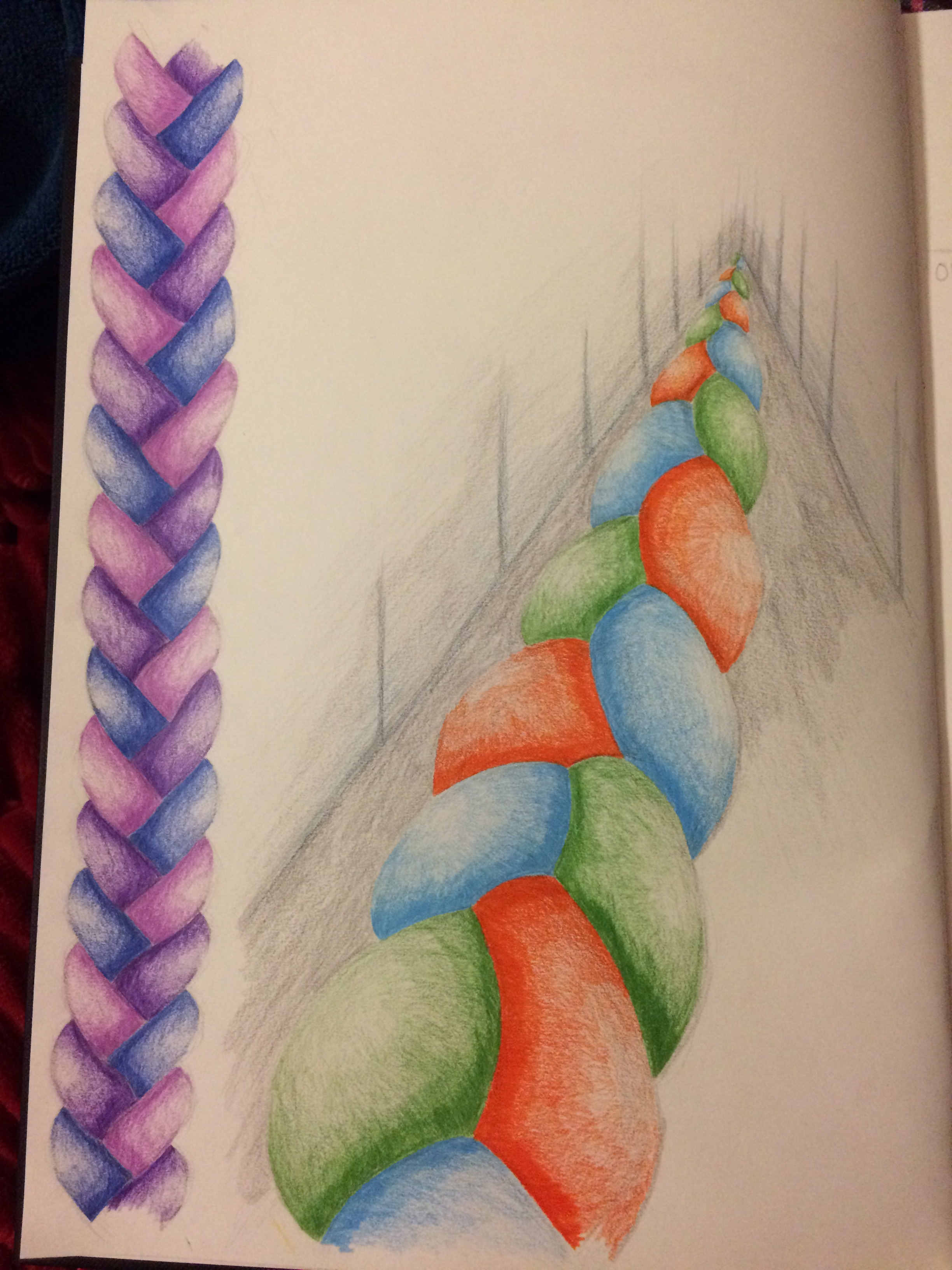
I also took a closer look at a plait. I had a couple of ideas from this design and that was to disrupt life by having the piece as big as possible, draped over motorways and building, OR, having it as almost like a tripwire across all entrances, exits, sidewalks, in order to disrupt life too. I wanted to do this in plastic as I feel very strongly about the subject matter of how much plastic we use, the reuse and recycling of plastic, and the fact that much of it still ends up where it is not meant to be e.g. the sea.

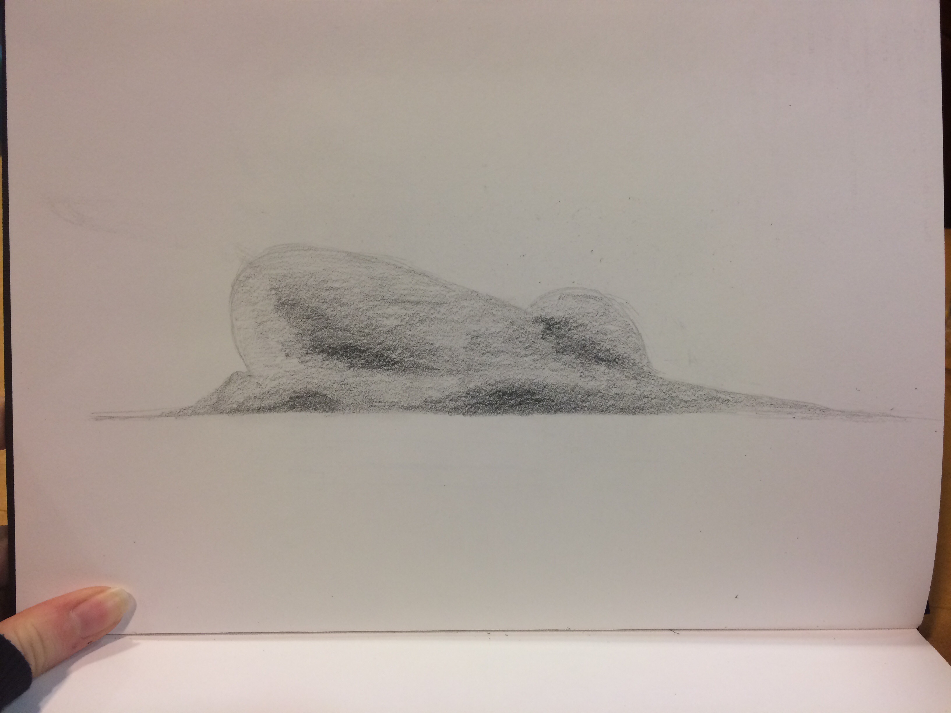
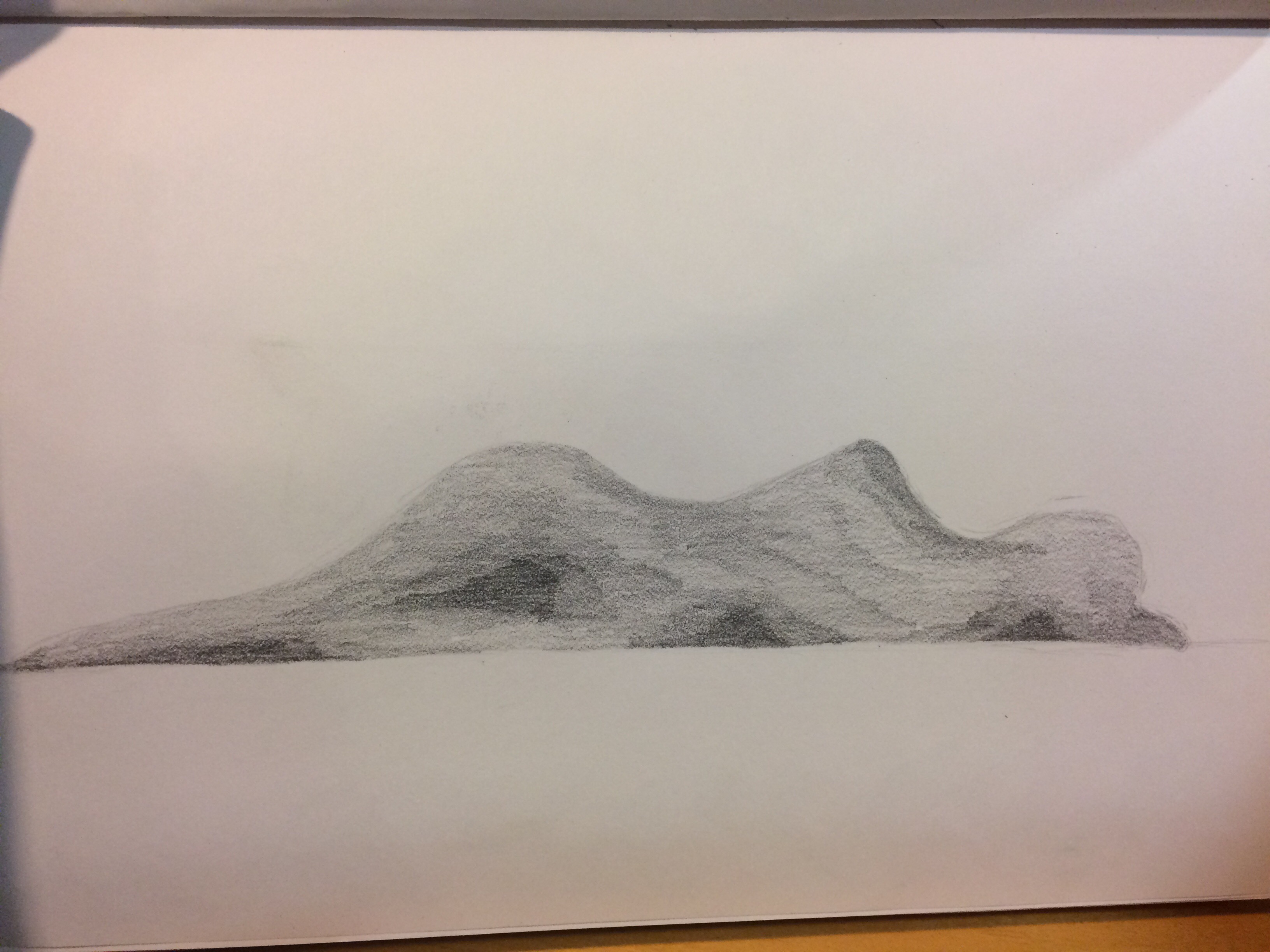
Taking a look at the body hills, I looked at yoga poses, which are often curved and smooth. I found that using yoga poses made them seem like hills, however they are still bodily shapes. These would be interesting to recreate in the third dimension.

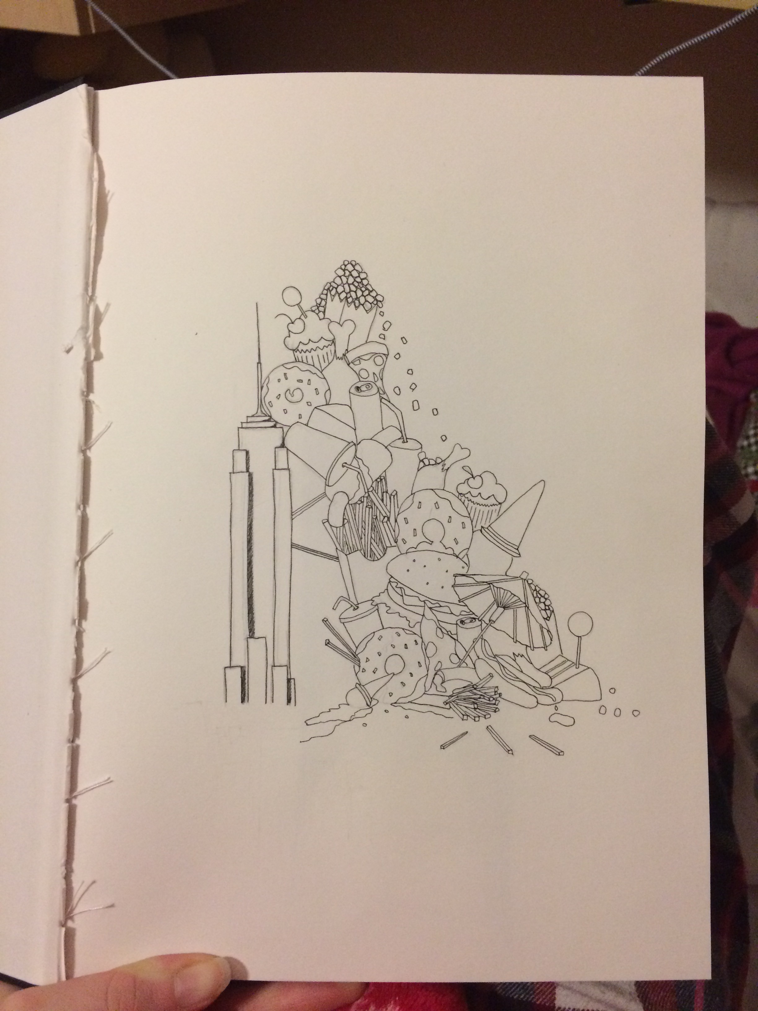
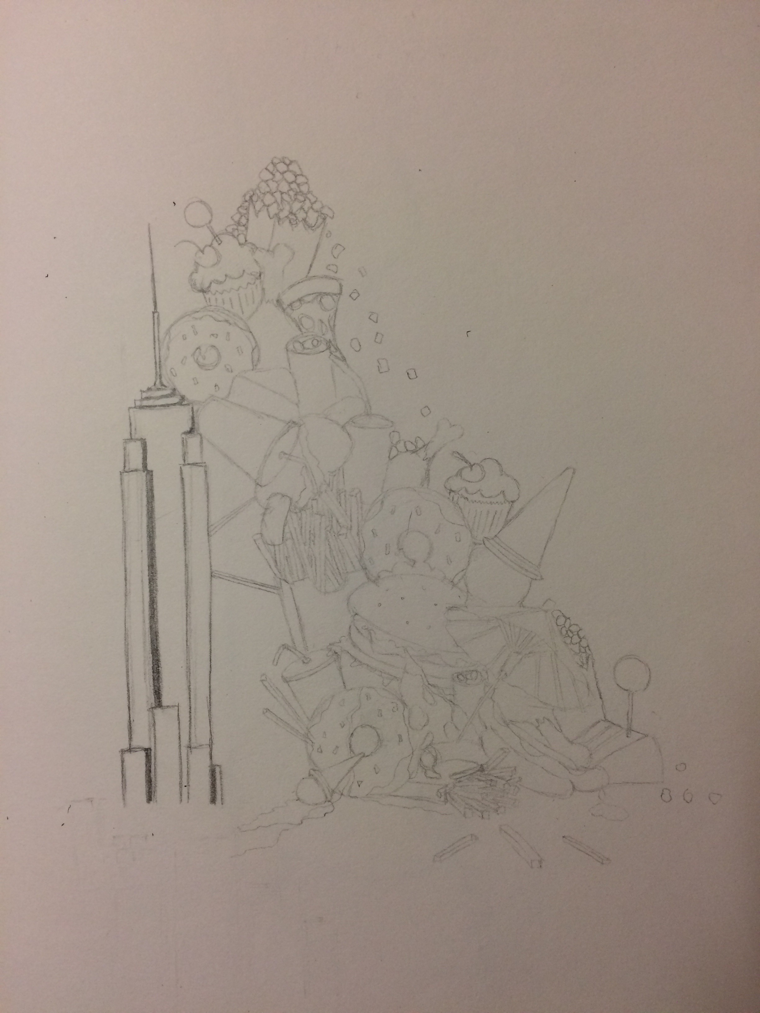
Lastly, I had a look at the giant food leaning against the Empire State Building. I chose to do it against this iconic structure in order to gain the sensation that the food is massive (like, really really big). This was fun to design and I look predominantly at junk food as this is the food that the current generations turn to when snacking. I felt like this would contain the bigger message of the problem about junk food, just as the plait contains the bigger message about plastic.

The Sole of A Student’s Day

The Sole of A Student’s Day is our final video for the video art, in which we worked in a group to complete, including; Layal, Hadis, Ikrah, Georgia, Romaisa, and myself.

Throughout this project, we came up with a story, filmed, and edited an entire 4 minute video that we were able to proudly present. It was quite refreshing working in such a group as many of these people I had not worked with before (no one except Romaisa). This allowed us to have new and fresh ideas as we worked all together. I also found that we had done things as a group that I would not have necessarily chosen if I was working on my own. This includes the inspiration of Pipolotti Rist and her contradictory work, which we continued through the use of the backing track versus the video itself. I liked the use of a unique theme of feet, as this was a different perspective to view a day of a student. This was very difficult to begin with, however once we got the hang of filming with a broomstick, clamp and camera, it was a very fun and enjoyable experience. Turning corners was still, and still is a challenge we need to overcome.

There was also a downside to working in such a large group as we were not all able to meet at one time through the week, and so messages were often second hand. I also felt like a lot of the work was passed to me, as the majority of the time, I was filming, or being filmed, and I felt responsible for getting the equipment, as no one else within the group was being proactive about it. I also spent around 12-13 hours editing the video, even though two out of our group of six had done the editing tutorial. Communication about the editing was also not done in person but rather through messaging because of the continual problem of not being able to meet up all on the same day. If we had to make the video again I would want to make it’s so that it isn’t as detailed and it was just one main thing, such as the date scene, as this would have allowed us to get some more detailed footage. Either that, or to literally record a pair of feet continually for a whole day, an speed up that one piece of footage (this again would have its complications but would be very fun to watch and complete).

Although there were many complications, I believe that our video came out very well. It was not what I thought we would produce, as initially I believed that we would do a small, cute little video of the sorts. However, it was an experience of where I gained many skills that which I hope to take into other pieces that I will complete throughout my degree.

Update 30/01/17: We showed all of our videos together today and got feedback – our lecturers loved the edit and the way in which the video tricks you at the beginning as though it is going to be a music video, but then shocks you when the Irish dancing comes in, and then you’re not really sure what is going to happen. They also commented that the editing was very seemless and worked well. One of our lecturers also said that they started to look at the feet as though they were an entity of their own and they had become their own character. So overall, a great success!

Extended version:

Other Groups videos:

Artist Statement

The main concept behind my painting is the confusion of reality, and the interconnection between man and nature. With the increasing growth of the manmade structures, nature is often pushed to the side, and sometimes even forgotten about. In a world where everything is electronic, we can often forget what reality is. My painting is a part of this story, a question of reality encapsulated in the wilderness of nature.

My work presents a large, portrait canvas, depicting a water forest scene and a partially derelict house. I was initially inspired by the work of Peter Doig, and his Concrete Cabin  (Doig, 1994) and Reflection (Doig, 1997) pieces. These are melancholic and contrasting pieces depicting thin forests. From these, I began to experiment with oil paints to create the same sense of depth within the forest that I would paint. This led me to the contrasting and colourful backgrounds of Zeng Fanzhi, with his bright backgrounds and dark, mysterious twigs in the foreground (Fanzhi, 2015). Inspired by this, I wanted to create the same contrasting atmosphere using a similar palette and repetitive layering of the paint. Under The Skin, a 2013 film (Under The Skin, 2013), further informed me of a large forest with unknown events occurring all around and to the central character, and also the depth and detail of forests, which I wish to recreate.

In my own work, I wanted to have a contrast in mood between the forest and the misty, colourful sky. By referencing the earlier artists, I hope to confuse and question the viewer as to “which way is up”, a question inspired by James Elkins (Elkins, 2009, pp. 11-32). I also wish to evoke the memory of nature in the viewer as they live in the ever-growing electronic world.

In addition, I was inspired by Cabin Porn, a book that takes you around the world with different cabins, with everything from being built with boats to being built on a cliff edge (Porn, 2009). This book helped inform my design of the small derelict house within the painting. I wanted to include a house within the painting, especially within an environment such as the forest, as they were once the home to many an adventure in childhood.

My piece presents ideas about the confusion of reality and the interconnection between man and nature through a contrast of colour and mood. The painting depicts a grand, overwhelming forest rising out of a lake, next to a small, derelict house sitting on the water. The contrast between the deep greens and blues of the forest and the light washes of reds and yellows in the misty sky distinguishes the contrasting atmospheres and highlights the interconnection and the power that nature has over man.


References:

Doig, P., 1994. Concrete Cabin. [Art] (Saatchi Gallery).

Doig, P., 1997. Reflection (What Does Your Soul Look Like?). [Art] (Tate Gallery).

Elkins, J., 2009. What is Painting?. [Online].Available at: www.jameselkins.com. [Accessed November 2016].

Fanzhi, Z., 2015. Blue. [Art] (Gagosian).

Porn, C., 2009. Cabin Porn Archives. [Online]. Available at: http://cabinporn.com/archive. [Accessed 27 November 2016].

Under The Skin. 2013. [Film] Directed by Jonathan Glazer. UK, USA, Switzerland: British Film Institute.


Thursday Exhibition Opening

And so it happens! Our first art exhibition as a Year 1 Art (and Psychology) student! It of course featured free wine, coke, orange juice and crisps. It was so nice to see everyone’s up on the wall after some incredibly hard work was done. For those who don’t know, our year is split into two groups depending on which day we get taught the Studio module. For us this year, it is the Monday group (my group) and the Thursday group (our enemies in this particular battle). I do have to be incredibly biased in this situation, however, and say that the Monday group definitely won this battle… And yet the war continues!

(Photos in order of; Thursday group, Monday group, Thursday Group, Monday group.)

Project 1.0 Political Prints

FIRST PROJECT OF THE YEAR! (Not including the summer project.)

So from the Introduction to Political Prints session that we had, we were given the task of producing our own political prints.

Here was our task debrief;

Art has had a troubled relationship with propaganda, which is frequently seen as overly didactic.

The history of print as a medium is often associated with radical politics. From the Russian constructivists to the art students of May ’68, to contemporary protest posters from many artists in countries around the world, artists have used print to create quick and bold statements, to combine images and text.

Using stencil printing, we would like you to produce an image that functions as a piece of propaganda in response to the challenges we face today in our societies and in our cultures. Consider the relationship between the imagery you use and the concepts you are exploring and think about what issues you would like your 2016 student revolt to address!

Source: Task debrief – Reading University Blackboard Learn

There are a lot of things that I feel passionate about and that I could do my stencil printing on, including the topics of; endangered animals, brexit, the American elections, sexism and feminism. But after a few hours of having a sit down, think, and a doodle (what else are you supposed to do?), I came across the quote

Can you see me now?

Source: Unknown

This led me to looking at the topic that was raised a few months back;

Free the nipple

When this hit the news, I felt incredibly passionate about the topic. My take on the subject was all about the women who were breastfeeding their babies in public. This is in no way, shape or form, is a sexual act, unlike how some men and reports I found were showing this. It is a simple act of the human body to want and need food, including those babies who still need fresh milk from their mothers. It did, however, become a fashion statement very quickly. This personally annoyed me as many of the articles reporting the ‘#freetheboob’ movement, were commenting on how uncomfortable bras were and how it is just commercialism that is making us buy bras. How ‘Free the Nipple’ became summer’s biggest fashion trend – EveningStandard. Yes, it has been scientifically studied as to whether women need to wear bras or not, and apparently we don’t, (Here’s Why You Shouldn’t Wear A Bra, According To Science – IFLScience) but that doesn’t mean we need a hashtag and a fashion trend about it, especially when it draws it away from the Free the Nipple campaign, which is very different.

I did not know this, but Free the Nipple is a lot bigger than just the whole breastfeeding in public taboo. The Free the Nipple campaign has been described as

…a global campaign of change, focused on the equality, empowerment, and freedom of all human beings. Free the nipple has become a premiere voice for gender equality, utilizing all forms of modern media, to raise awareness and effect change on various social issues, and injustices.

Free the Nipple Campaign

Looking closer and at more detail of what the Free the Nipple campaign truly stood for, I was inspired to create my own piece of propaganda to support the campaign.  I couldn’t exactly just whip off my shirt to reveal no bra to show my point, like hundreds of men and women did on Brighton Beach to protest against the social media policies banning on the female nipples.

‘Free The Nipple’: Hundreds Gather In Topless Protest On Brighton Beach – Huffington Post

I could, however, create a stencil printing, using my new found information on the Free the Nipple campaign, and the quote that inspired all of this; Can you see me now? I did have to take a moment to figure out what I could do inn order to get my point across – the female, and the male nipples, are something that we should not be ashamed of and that we should not hide. It should not be a taboo.

I therefore created the following design whereupon the nipple and the boob that are uncovered are the centre of attention, being the focal point of the print.


I initially couldn’t decide on whether I wanted this design, or to invert it and print where the majority of the page was black, showing a white boob and a black nipple. However, I soon realised that this could not be done as there would be multiple areas of the print that were not connected, hence I went for this design.

I also changed the composition of the wording several times. The consistent parts were the bra itself, the O, U and nipple. Initially, the ‘o’ of the ‘now’ was smaller, as to represent the other nipple. I did change this as it looked, to me, out of place, so I changed it to the now, larger ‘O’. I also changed the composition of the ‘y’ as originally it was vertical. The reason for this change was due to it being more aesthetically pleasing, but looking back, it now also follows the curvature of the breast which accentuates both the breast and the nipple.

The screen printing itself was interesting.. I have done screen printing before, however the screen printing ink has never stained this much! A tiny bit on my hands and it stayed there for days. As per usual, some of the prints were absolutely atrocious and barely legible, however there were a couple of them which were crisp and defined!

Drumroll please…

img_44121

img_44131

img_44141

Our exhibition isn’t fully up yet, but will be open on Thursday afternoon, so more photos and updates soon!